Wednesday, December 17, 2008

Graphic Standards Manual and Inspiration

I found a few graphic standards manuals online that are somewhat close to how I want mine to be laid out and used.
The first is from the Kiwanis organization. Their standards manual is very easy to use and gives good suggestions on how to use the logo in various marketing pieces with varying colors and applications.

The second I had posted before. The NASA online standards manual is not all that nice to look at, but I think it is useful because it is widely available. It gives lots of good information on how products and applications can be created, and also helps to make it easy to use the logo if wanted. This is what I envision for plus10. I think it is necessary to have the information readily available for people to use. Then, the program spreads, the name spreads, and the logo spreads and is more recognizable in the community.

My third inspirational standards manual is from animal world (download the .pdf to see it better from this site). This company has a similar audience, kids. This standards manual has color and utilizes some of its identity elements in the design of the manual. I think its important to make a standards manual that somehow relates to the company. I found many that were just on white paper with no design in them at all, just words and pictures with big 'x's over them. How boring!!

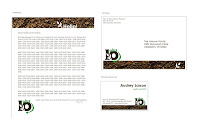
For my graphic standards manual, I wanted to keep it short and to the point. I envision plus10 as a program that aims at reaching as many people as possible, through as many avenues as possible. So, I kept my standards manual short and simple with suggestions for applications and some basic guidelines to follow.

Final Business System and Final Identity Presentation!

Hey all!

Well, I hope you enjoyed my final identity presentation. I was happy with how everything turned out. I am going to post some images from my final business system, my final logo design, and my some of my system application pieces. I should have taken pictures of them all, but totally forgot before I handed them off to Ange, so I'll just do digital files and some pics of what I still have with me.


The questions cards I posted were my original business system cards, but the only thing I changed for my identity presentation is the logo and some wording on the third card.
Now, here's my logo!!
I am really happy with how my logo turned out, after months of revisions. I think Barbara's comment about the slogan giving some information about the purpose of the 10 was excellent and I will definitely apply that to further revisions of my company.

Thanks for a great semester! I loved seeing everyone's work and am looking forward to next semester with you all again!

Wednesday, November 19, 2008

System Application Ideas...

Hey all!
My system application ideas are pretty straightforward, but I think they really make sense for my program. All would follow with similar graphics and layout as my business system (the brown bar and slightly angled text) and also include the ants, plants, and maybe a few more characters that speak more about recycling. The following is a list of products I am thinking about creating:

1. Pencils/notebooks/folders to hand out to the students at the beginning of the program. The notebook would be a small "field" notebook that the students would take with them on nature walks. Inside there would be sample baggies for collecting leaves and dirt for sampling, and also some fun facts and a calendar. 

2. Recycling bin mock-up  that would model the ones that would be around the school and in the lunchrooms. They will have fun shapes on the top that mimic the items that should go in there as well as big pictures on the side of cans and bottles, which will help remind younger students what they can and can't recycle. 

3. Posters (maybe 2) that would go along with the recycling bins. They will show what can and can't be recycled as well as get kids excited about the program. 

I think I will be able to complete all of these (hopefully) but depending on time, I might have to pick and choose which things I want to do. I think that the recycling bin will take the most time to complete because I want to do one that is close to the real size. But it is the most important piece of the system and needs to be there. 

Let me know what you think!

Monday, November 3, 2008

Two Business System Roughs...

Hello all! Here are two of my business system rough designs for Monday, November 3. Let me
know what you all think!

Tuesday, October 28, 2008

do you want to design like Barbara Kruger?

Well, please, look no further than the online graphics standards manual that tells you how to design like Barbara Kruger. Seriously?? 

Unfortunately yes. Design Like Barbara gives you tips on how to create designs in the same activist style as Barbara. From which photographs to use, to how to implement color and typeface, it's all laid out right here. Take a peek!


Also, I found an interesting standards manual for NASA. It's a completely different site from the normal NASA site, but  has all the necessary information for various effects and placements of the logo. How to use them correctly, and examples of badly used NASA logos. 

Monday, October 27, 2008

Revised Logo Design!

Hello all.

So, I was working in class today, and as everyone else seems to be doing as well, having problems with incorporating the logo and make it one unit. So, I took out some of the elements I had before, and really went towards a direction that I think I can apply to my other documents and products that I will be creating later on.

What do you all think?? I would love some comments on these before I turn them in on Wednesday.

Thanks much!!
Audrey

P.S. Here is an image of the logo I showed in class that was working the best.

Wednesday, October 8, 2008

Thanks for the great critique!!!

So, had a good time in class today talking about possibilities for my logo. I have decided to go back to one of my previous ideas and really spend some time making it render correctly on the screen. I also got some great suggestions from my group about directions to pursue to relate more towards my audience. An earthworm and a slug were suggested. Who would have thought?!?!

Well, I'll keep you posted! (no pun intended...)

Tuesday, October 7, 2008

Having some Creative Stumbles...

Well, I guess we'll see in class tomorrow, but I just cannot come up with a design for my logo that I am happy with. I'll give you guys a couple that I like the best, but really, they could be so much more interesting. I'm hoping to get some good feedback in class tomorrow morning and hopefully get these things looking a little more like what I would want for my program.

So, obviously they need some work. Well, let's hope I can come up with something better this weekend. Thanks!!


Monday, September 29, 2008

Company Logo Design: Brief

Name of Company: 10 years from now, Plus 10

Product/Service Offered: My company is a program that educates students ages 5-10 about the importance of reducing waste and recycling/re-using as many products as possible. The program will give students and schools products that are recycled as well as recycling bins to help promote the program everyday. The in-class presentations will be done by students that are ten years older than the little ones, so that they are really being influenced by these older, cooler kids and hopefully thinking that recycling is fun and cool!

Audience: As stated above, the main part of the program is targeted at kids ages 5-10 (kindergarten through 4th grade) and then taught by high school age students or volunteers. Indirectly, the program will also reach teachers and school staff because of promotional materials throughout the schools. Parents will also learn about the program through their students and hopefully start practicing good recycling methods at their own homes to reinforce what their students are learning in school.

What makes my company different? This program will be very influential due to the older students teaching and running the program for the younger children. The program focuses on one goal...TO MAKE RECYCLING FUN! And there are many ways, including fun-colored recycling bins and posters throughout the school, and ways for kids to be involved outside of school by reaching out to the community. This program is one of the only recycling and re-using programs that targets young kids, and promotes these activities at a very young age.

Objectives of Identity: This program aims to become a recognizable identity in school districts throughout the country as well as in the communities where kids are living. I think by making the program available and seen outside of the schools, it will become more a part of daily life in families rather than just an activity done in school. 

Monday, September 22, 2008

Design Process and Final Design - Clean and Clear

This was a really fun project to work on. The fact that we only had a little over a week really made this a quick turn around. But I think it was appropriate for the project and what we were trying to accomplish.

Throughout the week and a half that I was working on this project, I really relied on my own personal experience with the Clean & Clear brand. Having used the brand for many years, I found it was easy to envision how I would have wanted to see the brand when I was in the store buying it. I also did a lot of thinking about the current trends for natural, earthy products that are so popular among women my age. We all want to know that what we are using to clean our bodies is not just adding to all the junk that is already there.
I decided to go with a green color to portray the natural nature of the product. I thought that this color looked much more fresh and inviting than the deep navy blue that was used previously. I also experimented with various typefaces including Gill Sans, Myriad Pro, and Georgia. I also moved the placement of the text from the straight stacked style to an angled stack. I think that this is much more modern and also easier to read. And with the ampersand in the background instead of sandwiched in-between the two words, it is much more pleasing to the eye and the design is much more new-age


Then, I decided to see what other forms of design I could use to keep throwing the "nature" in your face as a consumer. So, circles, and some various shapes alluding to leaves were played with until I finally decided on the two stems coming from the ampersand to really bring the whole design together.


I really do think that this new logo speaks to the target audience in many ways, certainly showing that the product is environmental, natural, clean, and clear! The young women, probably ages 16-25 that are most likely to buy these products are very influenced by these traits of a beauty product and I think that the new logo will entice them even more to buy the product.

As stated in the earlier post, the purpose of the name and the company in its originality was to promote the product as fragrance-free and dye-free and an overall healthy product to use. And then when it was overtaken by Johnson & Johnson, I think it fell to close to the Neutrogena brand in its look and reputation. So, now, it's time to branch out (literally!!) and see what a fresh approach to this product logo could do for the company. Packaging will of course play a major role in it also, but I think that this logo is a good start for a re-vamp of the product.

Wednesday, September 10, 2008

Logo Re-design and GD2 Kick-off

I chose to redesign the Clean & Clear logo that we all know so well from bath-time. In choosing this logo to re-design, I felt that it really did not convey the feeling of clean and clear to it's audience, as well as looking outdated up against the array of competitors with fresh colors and cleaner looking logos. 
As the younger/cheaper sister company to Neutrogena (both owned by Johnson and Johnson), Clean & Clear is the brand they spend less money and time on because it is just starting now to develop into a widely used and positioned brand. Before selling to Johnson and Johnson, Clean & Clear was a small line developed by Revlon that boasted products free of fragrances or dyes, and left no residue after rinsing.  So, the product truly was clean and clear.
 

The audience targeted by Clean & Clear is young women, most likely ages 16-25. These girls care about their skin care and also don't have an excess amount of money to spend on the products, but they still want something that works well. 


Neutrogena's logo is a spiky se
rif font that looks much older and more refined. But the audience that is going to buy Clean & Clear because of the price and because it looks more appealing to them. I think that the logo can also be much more appealing to this audience. By using some updated/clean font and also changing up the color, I think the logo will speak "Clean and Clear" much more than it does right now. Some shapes that bring a bright and airy feeling to the logo would help break it out of the rounded box and just a little tweak on the type placement will update it and make it read much more easily. 

Here are a few examples I used for some inspiration....


Ok, so we'll see what comes of all of this!!